Edinburgh Park Architecture, Scotland, Designs, Images, Project, Developer
Edinburgh Park Competition
The G4 competition won by Campbell & Arnott Architects
Edinburgh Park Contest
G4 Granted
Latest Edinburgh Park building approved: Erection of office development at 1 Lochside Way (Site G4) by Campbell & Arnott granted 22/11/2007 for New Edinburgh Limited
News Update Sep 2006
1 Lochside Way, Site G4, Edinburgh Park
Campbell & Arnott Architects for New Edinburgh Limited
Minded to Grant 27/09/2006
G4 Competition + Exhibition
Winner: Campbell & Arnott
Runner-up: Gordon Murray + Alan Dunlop Architects
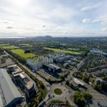
NEW EDINBURGH LTD, developer of Edinburgh Park, invited architects in Scotland to submit design ideas for a £2m office building. The G4 offices were to incorporate an innovative marketing suite for NEL. Details can be found at www.edinburghpark.co.uk
Review of G4 Exhibition held at Edinburgh University:
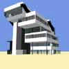
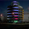
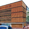
Everyone from Ushida Findlay to Keppie Architects here: don’t miss the wild overhangs of Duffy & Batt (top), the trendy Dutch folds of ATA Studio, or – by the door – the spaceship of Watson Burnett Architects, surely a joke entry. Considered and innovative schemes from the likes of Sutherland Hussey Architects, Oliver Chapman, Gordon Murray + Alan Dunlop, Richard Murphy (above), Andrea Faed, Malcolm Fraser Architects and CIAO.
see unbuilt for more G4 images
Edinburgh Park Architecture
G4 Edinburgh Park Exhibition
Matthew Gallery, School of Architecture, Edinburgh University, Edinburgh
Review by Bruce Ross
Unfortunately, I left it very nearly too late to see the exhibition of entries for the G4 site of Edinburgh Park and it was not until leaving the gallery space that I allowed myself time to take on board the information that paraded outside the venue.
Such a bizarre typological condition as the remnant plot in a master-planned suburban business park prompted a number of the entrants to look for suitable precedents. As I stood digesting the information hoarded outside the exhibition space, I recalled a recent visit to Berlin: I been out scouring the city for traces of its recent past when I discovered ‘The New Checkpoint Charlie’; pleasantly printed onto a modestly coloured sign in the window of a new commercial building, whose interior glimmered with marble and gold, was the following explanation – “The combination of business and residence, historic location and innovative technology, ‘Berliner Luft’ and American Flair, makes Checkpoint Charlie a special place.” It seemed questionable that the site’s history could so gamely surrender to spawning a space worthy of such enviable speciality.
I am uncertain of the exact history that surrounds the area of land known as ‘Edinburgh Park’, but I would imagine that it is less contentious than that of the Germano-American development’s. All the same, the spiel that introduced the Scottish exhibition seemed deeply entrenched in (superficial) comparisons. “Edinburgh Park combines design, aesthetics and quality to create an environment which has unrivalled visual impact as a vibrant place to work.” The display reverberated. “Tree lined boulevards, elegant water features and open spaces combine to create an attractive landscape which reflects the changing seasons. The Park has attracted its own wildlife including mallard ducks, hooper swans and herons.”
Was there a latent injustice that the Park was potentially rectifying? By purifying and containing its environment, did the Park speak more about a possible violation? The accompanying images suggested otherwise: Below a highlighted caption, the moral “right environment”, lay a highly convincing portrait of a man and woman couple, each one pushing a pram, whilst further behind, in the water (feature) to their side, were a couple of swans, with signets on tow. Behind the pair of couples, beyond the line of newly planted trees was a pristine office building. Even after close scrutiny, I am reluctant to admit that the scene stems from a photograph, and not a fragment of a computer generated ideology.
The building successful in occupying the G4 site would be, it was proclaimed, “in good company”. The entries that looped the perimeter of the Matthew Gallery numbered over one hundred and judging the winner must surely have been a tough task. Entrants were required to submit two A1s worth of proposal, so it was not unexpected within the restricted format to see basic similarities between the various schemes.
What was, however, ever so slightly unsettling was the uncanny resemblance many of the ideas had with certain stylistic building typologies: ten G4 entrants featured a façade or primary element that curved through its vertical section; eleven played sweeping internal horizontals against the formality of a structural grid; eight made use of a ‘drum’ or cylindrical motif; seven settled for boxes that seemed to cantilever or step-out over the ground below. Admittedly the aforementioned pigeon-holing would seem to embrace a truly broad spectrum of architectural forms, but this is perhaps what suggested a ready fallibility to a number of the schemes: they appeared as if they had been electronically concocted from a collage of images ripped from recent copies of architectural journals.
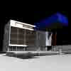
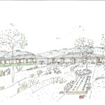
A selection of the entries appeared to be nicely considered schemes and an obvious amount of care had been spent in Photo-shopping in images of young, beautiful office workers and smart, shiny cars in many. One G4 entry had been cunningly disguised as a water-coloured drawing and the aesthetics technical pen added drama to another. Some of the drawings featured strange remnants from an under-budget Post Modern America and some conjured-up images of a decidedly ‘kool nu-Dutch’ environment. Crazy slit windows appeared also to have made an upsurge in popularity. All this generic variety is great and symptomatic of a healthy dose of contrived experimentation. It would be unfortunate, however, if these architectural tropes had been employed as purely stylistic measures.
I have long wanted to see a perspective drawing of an office block emanating from behind a workstation, or a section slicing through a penthouse board room, complete with ‘smartly-dresseds’ sipping coffee at the summit of the structure, whilst on lower levels other workers sneak-off for a sly cigarette beside the cafeteria. Whilst it is perfectly reasonable to decorate the imagined spaces of an architectural proposition with clean-living people in active poses, it would scandalous to think that such devices augment the seductive capabilities of the scheme.
A suitable (prophetic) summary for many of the schemes was provided by one of the entries:‘As an “object building”, all vantage points are considered important. From within a cubic mass, the building is poised with a latent energy, a tension between the self-contained, static form and something ready to burst into life.’ By exchanging ‘cubic’ for another volumetric mass, one could surely describe any building form that has not yet manifested its true potential.
It is natural for there to be a pleasingly competitive air to architectural competitions (clearly), it is also unavoidable, I suspect, that in filling the spaces of a master-planned, constructed landscape, many of the individual buildings present themselves as discrete objects. It is laudable that many of the schemes – the winner included – star ‘environmental’ devices, and have blatantly considered ‘the environment’ in its greater sense. Occupiers of the schemes might suggest that the dedication with which designers approach – and document – the big brother of such issues (the ecosystem), could be well advised to present evidence of a similar approach to the importance of the tinier relative of these concerns (the surroundings).
The above entry later described how, in strategic parts, the proposal ‘opens towards the heart of the park’, in all probability, an area entirely devoid of romance and incapable of stiriing emotions. The image that seemed most compelled to wear its heart on its sleeve was located in the early teens of the exhibition entries. In bold black and white, it presented the exterior of its scheme in its immediate context; in the foreground was a mighty car park, replete with comfortable vehicles of several varieties. Frustratingly, in this concocted speculation, a clear representation seemed far closer to reality than theduplicity of the waterside golden couple photographed insitu.
Scottish Capital Building Designs
Contemporary Scottish Capital Property Designs – recent architectural selection below:
Comments / photos for the Edinburgh Park Architecture Competition page welcome
Edinburgh Park Competition Building : page
