Hotel Missoni Building Edinburgh photos, Architect, Scottish location, Interior pictures
Hotel Missoni Edinburgh
Royal Mile accommodation: New Edinburgh architecture by Allan Murray Architects, Scotland, UK
INTRODUCTION
Missoni Hotel Edinburgh
The existing late 1960s George IV Bridge building, formerly known as the “Lothian Region Headquarters,” (LRC) was located within the heart of Edinburgh’s historic Old Town on George IV Bridge, between the Lawnmarket, and Victoria Street. The curtilage of the site also includes existing smaller, historic buildings facing onto the Lawnmarket, which are A-listed.
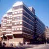
The LRC rose 6 storeys (plus a mansard-sided top level of plant) above the level of the Lawnmarket. As the level of George IV Bridge fell southwards, seven storeys (plus the mansard-sided top level), sitting on top of a plinth, concealing a car park level on Victoria Street.
photos : Keith Hunter Photography
The site occurs at a crucial position in the Old Town: one of the first buildings seen upon approach from the north up Bank Street, it is also on a pivotal location on the Lawnmarket as it is approached from the south up George IV Bridge, or up Victoria Street. In addition, it starts the final ascent to the Castle on approach from the east. For such a prominent location the office building offered very little to the visitor at this critical part of the city: there was no activation of street frontage, or uses which enlivened the main thoroughfares.
Prior to the LRC the site was home to a row of tenement buildings, whose gables and chimneys suggested a series of five vaguely classical pavilions. At the junction with Victoria Street, the end pavilion was arcaded, providing a delightful entrance to Victoria Street. There was barely an acknowledgement of the Lawnmarket as the northern pavilion at the top end met it.
photos : Keith Hunter Photography
THE EXISTING STRUCTURE
The building’s structure consists of a series of pre-cast concrete floor units resting on a series of in-situ cast concrete slabs. These are supported laterally with shear walls in the form of stair and lift cores. However it also became clear that the heavy engineering in the basement transfer slab and retaining the walls would pose significant issues to the adjacent structures if removed. The decision was reached to retain construction to street level and thereafter to erect a new building above.
We proposed that the George IV Bridge Wing be demolished down to Level-1, retaining the existing transfer structure and Level -1 floor slab. The existing “West wing” would be partly demolished down to Level -2, with the existing ground slab and retaining walls, to the North and West sides of this area, remaining undisturbed, as far as possible.
A new steel framed/composite slab structure was erected on top of the existing transfer structure, clad and roofed with quality materials and finishes, in a modern idiom which is sensitive to its historic setting. The profile of the new building envelope was altered in order that it fit into the historic grain in a more responsive manner. The overall height was generally retained, although the bulkiness of the LRC was tempered by modulation of the facade and roofscape, and with the introduction of focal elements, an approach in keeping with a city of full of rich townscape features.
The interiors of the smaller, existing, historic buildings facing onto the Lawnmarket, were incorporated into the general complex in the 1960s.
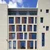
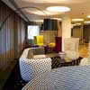
photos : Keith Hunter Photography
THE BRIEF
The brief was to create a new facility for the Bank, a Hotel and retail units with car parking. In addition our architectural urban brief was to:
– Create an active ground floor, with strong visual and physical permeability.
– Create an appropriate roofscape, which reverses the driving horizontality of the Lothian Region Headquarters building
– Establish a relationship with the morphology of the High Street
– Respond to the character of George IV Bridge and the pavilion-like nature of the buildings
– Complete Victoria Terrace and Victoria Street, and provide a suitable urban entrance for them from George IV Bridge
– Establish a dense courtyard, in keeping with the site history, and with activated places and closes
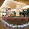
photos : Keith Hunter Photography
THE HISTORIC CONTEXT
This project demonstrates our strong commitment to the public realm, with a vibrant and complex building. It strikes a balance between being assertive and confident, and at the same time being respectful of its context.
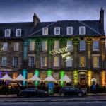
The mixed use development is anchored by the newly opened 136 bedroom flagship hotel for the fashion house Missoni (in a joint venture with Rezidor), also containing restaurants, boutique retail and leisure uses, and a new branch for the HBOS banking group.
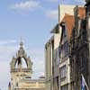
We developed a philosophy of “unity through diversity” with different approaches to the building faces – an analogy of the “end grain” of Royal Mile frontages with vertical emphasis and a delightful timber jetted segue piece; the three “palazzi” frontages of stone tracery responding to the Victorian public buildings marching down George IV Bridge; and a new, sinuous arcaded entrance to Victoria Terrace.
Inspired by the tradition of hard-won public space carved out of the urban frontages (as seen in nearby Gladstone’s Land on the Lawnmarket), new loggias are introduced to address each frontage and establish entrances for several additional uses brought to the site. The re-animation of the street with many uses – shops, cafe, hotel entrance, conference uses, as well as a bank branch – is critical to the success of the design, and this extends to reinstating the historic vennels though and courtyards within the site, where a new restaurant is located.
Lawnmarket / Royal Mile
We felt it was very important to recognise the original morphology of the High Street. The tight knit vertical emphasis of the frontages to the High Street are characterful and distinctive. The tenement opposite (containing Deacon Brodie’s pub), with its strong blank gable provides a compelling model of the foreland building fronting the High Street, regaining a clear distinction in the hierarchy of the urban grain. A simple analogy is the difference of the ‘end-grain’ and the plane-faced grain of blocks of wood.
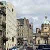
We proposed a balancing block to the Deacon Brodies’s cut gable with a simple solid gable. The front takes advantage of the prospect to the north, and the Bank of Scotland on the top of the Mound. The scale of the elevation lightens towards the sky. On the ground floor, a new entrance loggia, a reinterpretation of the “piazza” opens up the corner, and creates a distinctive feature seen when approaching from St Giles.
The result will be a building which has directionality and frontality addressing the major street in a positive manner.
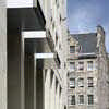
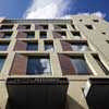
The scale and compositional nature of 302-304 Lawnmarket is reinterpreted through the new proposals. The new frontage is divided into two vertical components – one stone, one smaller, timber. The effect is to create a vertical scale as well as a diverse and rich facade. The elevation of the stone element is composed of openings which give the effect of the building becoming lighter at the top emphasising the more articulate roofscape.
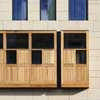
Faced in oak treated with Danish oil, the oriel window and timber facade echoes Edinburgh’s tradition of jetted timber galleries and half shuttered windows still seen in Mowbray House and Gladstone’s Land. The window is the only element to push out from the line of the facade – all other openings are deeply incised – emphasising the frontality of this piece.
It marks the significance of the double height entrance to the bank below, and introduces the next tall, thin frontage, itself a series of jetted fronts faced entirely in oak boards. The oriel window is deliberately underscaled as a contrast to the tall loggia, playing up the solidity and mass of the stonework.
photos : Keith Hunter Photography
GEORGE IV BRIDGE
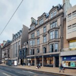
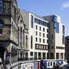
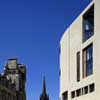
In Thomas Hamilton’s design for George IV Bridge he suggested the street should be designed with buildings in a “Flemish Style”. George IV Bridge is very different from the High Street and is characterised by a series of individual pavilion-like buildings on the street. Our approach is to continue this idea, and develop the concept of three separate pavilion-like buildings.
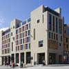
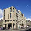
The building is therefore composed of three strongly defined ‘tracery’ facades, and four more solid tower elements separating them. The cornice lines step down the bridge in sympathy with the levels. The main building plates also step down, creating many interfaces with the street levels.
The central pavilion defines the entrance to the hotel. which is also marked at street level by the deeply recessed entrance loggia. Each of the large open facades contrast with the solid towers: a balance of tracery against wall.
The southern-most tower, at the entrance with Victoria Street, has a loggia to form an arcaded entrance onto Victoria Terrace. The northern most tower, at the corner of Lawnmarket, also opens to form a loggia to the High Street.
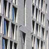
The depth of the window reveals will create a compelling rhythm of shadows along the street. This makes particular reference to oblique views of the surrounding traditional buildings, and their rhythmic pattern of shadows cast at window jambs.
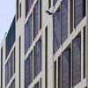
The rhythmic language of the building is also inspired by the distinctive Missoni stripes, and a playful approach to pattern-making. When seen from the Royal Mile, the angled timber panels in the George IV facade display their timber faces; when seen from the other side, only stone, with flashes of silver is visible.
VICTORIA TERRACE
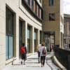
An important aspect of the building as it addresses Victoria Street was to continue the curve of the street wall, above the arcaded wall of shops completing the geometry of the street.
The Victoria Terrace level is activated by extensive glazing, creating a lively street frontage, but it is “anchored” by the arcade to the east, and a tower element to the west (as a counterpoint to the baronial tower of India Buildings). The arcade relates to a corresponding element in the adjacent Baden Powell House creating a rich experience of openness and closure along the terrace.
In contrast to the upper level of Victoria Terrace, Victoria Street is a very different and unique character. We decided that the lively and almost “bohemian” base of arched shopfronts should continue to a fitting termination. We maintained the line of the railings and recreated a series of arched indents.
We believe that the new entrance arcade to Victoria Street/Terrace will enliven both levels and help generate greater use of the Terrace by pedestrians as well as improving links to the High Street and West Port.
photos : Keith Hunter Photography
THE INNER COURTYARD
The courtyards of Edinburgh are hidden assets that are often under utilised. We introduced the hotel restaurant at the heart of the courtyard. The restaurant will offer passers by on the High Street an opportunity to access the courtyard and bring the backlands into new life.
BUILDING ENVELOPE
The external walls, forming the North, East and South facades of the new George IV Bridge Building, are finished in natural sandstone, incorporating both prefabricated hardwood panel and glazing elements. Strong vertical elements within these facades visually break down the mass of the new building.
Hotel window and screen glazing, within the new George IV Bridge building envelope, is a combination of various different high performance double glazed systems with a polyester powder coat finish to the aluminium framing sections.
The rear courtyard facades of the new George IV Bridge building envelope is finished in natural wood faced panels, in conjunction with sandstone.
The new dual pitch roof proposed to the George IV Bridge Wing of the new building envelope, is finished in single ply membrane, with standing seams and zinc edge trims. The finish to the roof tower elements is sandstone, to match the general envelope finish and reflect the gable chimney structures, prevalent in the area.
The new external roof plant of the George IV Bridge building, is set back from the general facade line, to reduce its visual impact and is screened with anodised aluminium louvre panelling.
The existing A- listed Lawnmarket building fabric was completely retained and repaired.
LANDSCAPE AND PUBLIC REALM
One of the key aims of the development of the design was to substantially improve the quality of and experience of the streetscape.
These aims are addressed in the manner in which the building meets the ground, new entrances, arcades and loggia all reinforce the quality of the public realm. The street improvements already carried out on the High Street – Caithness Stone, granite kerbs and cubes were continued throughout areas within the site boundary. The pavement at the top of Victoria Street was widened to improve the pedestrian link with George IV Bridge.
In addition a ‘softer’ link to Victoria Terrace is created by new steps where the two levels meet – similar improvements were made in the courtyard where a palette of quality materials such as Caithness stone and granite was used. The Lawnmarket corner of the building opens up as a loggia entrance. The streetscape materials, again granite steps and Caithness floors are continued in here to reinforce the public realm.
INTERIORS
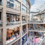
One of the most challenging aspects of the site, featuring a 6m change in level from the Lawnmarket down to Victoria Street, was how to provide continuously active and engaging frontages – both on the streets and within the courtyard – and to reconcile this with a building type that demands essentially level floors of of bedroom accommodation.
This is solved by introducing stepped platts, and balcony voids following the ground level round. The use of the loggia also signifies key entrances and allows the frontage to step in so it can be accessed by tapering steps to a point of level access. Each loggia addresses a double height space behind with views out – a series of urban scale rooms within the building.
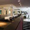
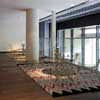
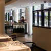
The Hotel uses the bar, staircase and restaurant to connect the outside of the urban block with the courtyard deep in the heart, accessed by closes. This allows one of the key characteristics of the Old Town – the narrow closes and courts – to be reinvigorated with active uses.
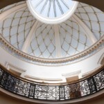
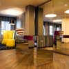
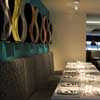
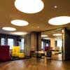
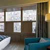
Exploiting a range of rich and colourful textiles designed by Missoni, Milan-based Matteo Thun, working with Graven Images and Allan Murray Architects, developed a heavily decorated environment with intensely coloured highlights. Mosaic, leather, silk and aluminium are mixed in with more conventional materials such as mirror, back painted glass and plaster. The result is a special vibrancy we have likened to the “flash of a colourful lining on an elegant suit.”
THE LAWNMARKET BUILDINGS
The two late 16th century, early 17th century tenements fronting the Lawnmarket have considerable charm and character, and hark back to the medieval feu widths. One, constructed over Buchanan’s Close, is harled. The other, over Brodie’s Close, features exposed rubble stonework and a round arched pend.
The irregularly spaced windows in the harled building seem to slide back and forth in rows that jet out, formed by early timber framing. The roofscape of the tenements display a picturesque composition containing a crowstepped gable, swept dormers, and a distinctive jerkin-headed gable.
Sadly in the 1960s, the interiors were gutted, though the original turnpike and two painted ceilings dating from the 17th century were retained. These buildings have been incorporated into the hotel, offering a characterful set of rooms and showing off the restored ceilings featuring flowers, birds, fruits and figures rendered in earth tones.
The new building creates a dialogue with these tenements, and takes certain regulating lines and rhythms from them.
Hotel Missoni : Photos by Adrian Welch, 25 Jul 2009
Hotel Missoni interior : Information from Matteo Thun & Partners
Location: Edinburgh, Midlothian, southeast Scotland, UK
Scottish Capital Building Designs
Contemporary Scottish Capital Property Designs – recent architectural selection below:
Previous Building on the site, by celebrated architect Robert Matthew (RMJM)
picture © Adrian Welch
Hotel Missoni context – HBOS HQ on The Mound
George IV Hotel context – National Library of Scotland
George IV Hotel Edinburgh original building on the site
Hotel Missoni Edinburgh context – Royal Mile Edinburgh
Comments / photos for Hotel Missoni Edinburgh page welcome.
