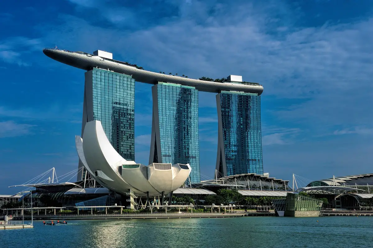
How architecture design of casinos changed guide, Bingo buildings, Gaming resorts style advice
How Architecture Design Of Casinos Changed Advice
11 February 2022
Casinos have constantly been evolving – it’s the only way they can keep attracting customers. It’s even become more critical with the advent of online gambling. Customers no longer need to adhere to a dress code or commute to play their favorite games.
How The Architecture Design Of Casinos Changed Over The Years
Even bingo lovers can skip the trip to bingo halls and play live bingo games from their phones. And with bonuses and promotions in tow, they spend much less on wagers and still get to enjoy generous returns. You can click here to get a feel of the sites rocking the worlds of bingo lovers. Players on these sites get to play various bingo games and vary the balls to enhance their winning chances.
So, with all these developments, you can imagine that casinos cannot rely on the same old designs that worked in the past. They have had to change their approaches. But how have they done so?
The Old Design
Let’s start with what casinos were back in the day. And we have Bill Friedman to credit for this great work. Bill, like many other casino lovers, had a gambling addiction. And he used this experience to enhance the casino design to get more people to place wagers. How did he do it?
- No track of time: Bill insisted that casinos should not have windows or clocks. As such, players could keep gambling without knowing just how much time they had spent indoors. The result? – they wagered for longer, thus increasing casino revenues.
- Distractions: If you have ever tried to find your way to the bathroom in a casino, then you have likely seen this design at work. The goal is to have necessities placed at the far end. That way, as you walk towards them, the casino’s layout can entice you with other games. You end up exploring the other options, increasing the chances of wagering.
- Intimacy: While casino floors were huge, Bill found a way to create several intimate spaces in them. That way, players felt more comfortable gambling for longer.
- Colorful machines: The décor in casinos are the machines. So, casinos put a lot of effort into making them visually attractive. Players end up drawn to the machines because that’s what grasps their attention from the start.
Additionally, Bill insisted on setting up play stations at the entrance. It ensured that the casino did not waste space and that players could start gambling from the onset. Try playing play online bingo for real money.
The Modern Design
What comes to your mind when you think of the Bellagio? Even players who have not been to it have heard of it or seen it in movies. It’s the epitome of modern casino design, all thanks to Roger Thomas. So, what did he do differently from Bill?
- No Traps: Roger likened the traditional casino to a trap. After all, the design was crafted to get players lost in the casino as they tried to reach the bar, bathroom, etc. Roger argued that rather than make customers comfortable, this design only made them hold off on wagers. After all, who wants to spend money when they feel trapped?
- Openness: Bill insisted on closing the blinds and ensuring that players did not have access to the outside. But Roger felt that inviting the outdoors into the casino was a good bet. So, he lifted the ceilings, added skylights, opened the windows, etc. Players could now breathe in these spaces.
Were these changes profitable for casinos? Oh, yes! Players enjoy being in an open space where they can wager, socialize, and let off some steam. And if the surrounding is beautiful, they feel inclined to spend more time in it.
Thus, now casinos focus on how the player feels and play on these senses. They boast music, unique scents, state-of-the-art décor, clean air, etc. And as a result, players feel more relaxed and are more likely to become repeat customers.
Interestingly, Roger’s design made its way to the online scene, including gaming apps. Gambling sites now put a lot of work into ensuring that the user interfaces draw people to playing more. So, the design is overall effective.
Comments on this guide to how architecture design of casinos changed article are welcome.
Edinburgh Architecture
Contemporary Scottish Capital Property Designs – recent architectural selection below:
Trinity Academy Edinburgh secondary school building
Princes Street Hotel Edinburgh City Centre
Royal Botanic Garden Edinburgh Palm Houses Restoration
Comments / photos for the How architecture design of casinos changed advice page welcome.


