Edinburgh Mezzanine Apartment, Scottish two-bed home building image, Accommodation Design Scotland
Mezzanine Apartment in Edinburgh: Home
Double-height Flat in the Scottish Capital transformed into two-bed home
Tour a Unique Mezzanine Apartment in Edinburgh
Installing a mezzanine floor in this double-height apartment turned it from a one-bed flat into a two-bed home
16 Nov 2016
Mezzanine Apartment in Edinburgh – 2-bed Home
Article first published on Houzz
Finding a property that offered the space and features they were after in the perfect location was a challenge for architect Jonathan Thomas and his wife, particularly as they were first-time buyers. When they came across this one-bedroom flat in a 19th century former nursing home in central Edinburgh, however, Thomas tapped into some potential that possibly only an architect could spot.
Houzz at a Glance
Who lives here Architect Jonathan Thomas with his wife, a graphic designer
Location Edinburgh, Scotland
Size 1 bedroom plus 1 spare bedroom/study/living space, 1 bathroom
Architect Jonathan Thomas at Dog + Fox
‘The flat had 15ft-high ceilings and three large windows,’ Jonathan Thomas explains. ‘Straight away, I thought I should be able to get a mezzanine floor in here. It’s a listed building, though, so I went and spoke to the planners about the best way to get Planning Permission, which I always find very helpful. They said as long as we used a glass balustrade that wouldn’t disrupt the view of the cornices, it shouldn’t be a problem.’
Planning Permission was duly granted and the couple set to transforming the apartment.
As the kitchen and bathroom were already in place and the couple were on a tight budget, they decided to live with the existing décor and plough their money into creating the striking mezzanine floor.
‘Instead of refitting the interior, we built on what was there,’ says Thomas. ‘I designed the whole mezzanine floor to hang from a steel frame that hangs from the external walls. It was quite a feat of engineering to do this without making any changes that were visible from the outside.’
Discover more fresh hallway ideas
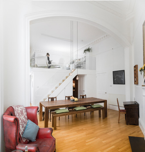
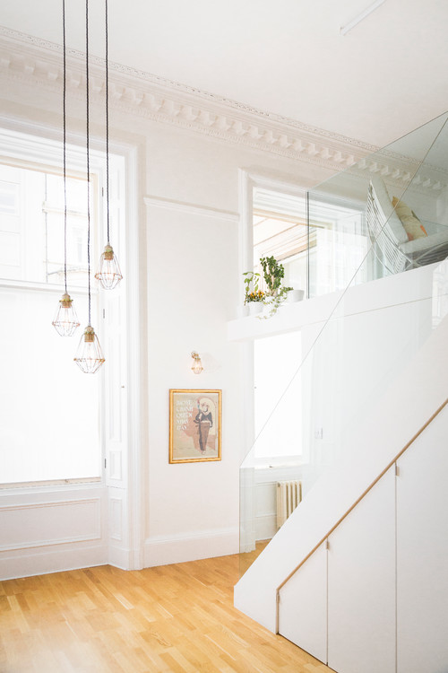
As the couple have a large family and tend to host all major celebrations such as birthdays and Christmas, they chose to keep the ground floor living space open-plan. The dining table is the central focus of this room and is illuminated by long, industrial-style pendant lights that dramatically drop down from the double-height ceiling.
‘It was key that we would be able to seat between 12 and 14 people comfortably,’ Thomas says. ‘We had a table built specifically for the room from reclaimed ceiling beams. This table has lots of character, just like the building, and we’re not bothered if it gets a ring mark from a glass of wine on it or becomes scratched. All these additions remind us of the good times we’ve had around it,’ he adds.
‘The chairs came from a local thrift store. We’ve tried to balance modern and shabby chic furnishings in here, to be in keeping with the two different architectures of the place.’
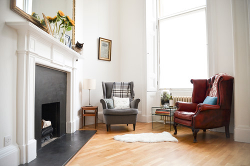
A couple of armchairs have been tucked around the corner from the dining space, facing the fireplace, to create a more intimate seating area.
‘When we first viewed the flat, they had the dining table in front of the fire, hiding it from view, which was such a shame. We’d always wanted an old chesterfield with a rug by a fire and now we have one,’ Thomas laughs.
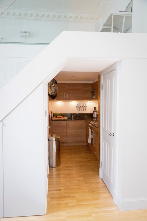
The couple decided to keep the existing simple kitchen units, as they didn’t detract from the minimalist style of the flat. They then had the whole place painted pure white. This trick can also be seen on 11 Small Apartment Hacks among other techniques for improving smaller spaces and units.
‘We did try out a white with a faint pinkish hue, but with all the timber in here and so many competing materials, we decided in the end to keep everything simple with a low-sheen white,’ says the architect.
Thomas designed the staircase to be quite simple, so as not to detract from the glazed mezzanine area and impressive ceiling space. As the couple needed to squeeze maximum storage space out of the scheme, he incorporated deep cupboards under the stairs.
The pendant lights are on a dimmer switch, so they can be turned right down to give a candlelight effect when desired.
Pendant lights,Artifact Lighting.
Discover how you can make more of your staircase
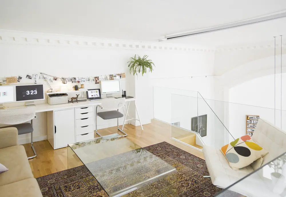
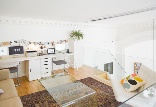
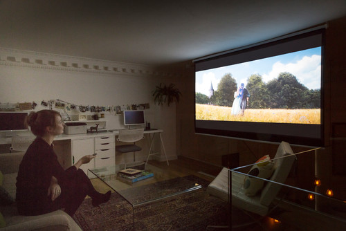
While the downstairs is the main social space, the mezzanine floor is used as a home office, an additional cosy seating area, a guest room and a home cinema. In total it covers 15 sq m.
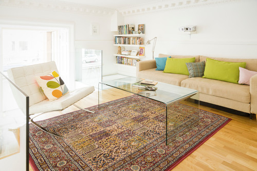
‘As a lot of our budget had gone on the construction of the mezzanine, we had limited resources when it came to furnishing the flat, so we’ve largely gone for a mix of Ikea staples and charity finds,’ Thomas explains. ‘We discovered the glass coffee table on Gumtree. It was a real bargain and ties in so well with the glazed areas of the mezzanine.’
Desk, Ikea.
In this versatile space, the sofa opens out into a bed and a projector screen can be pulled down when the couple feel like a movie night.
Take a look at these marvellous mezzanines that rise above it all
The couple changed the feet of their Ikea sofa for a tapered design to make it look a little smarter and more individual. The engineered oak flooring downstairs was kept and matched up here to help tie the two areas together.
Karlstad sofa; rug, both Ikea.
Dip into 12 easy furniture hacks
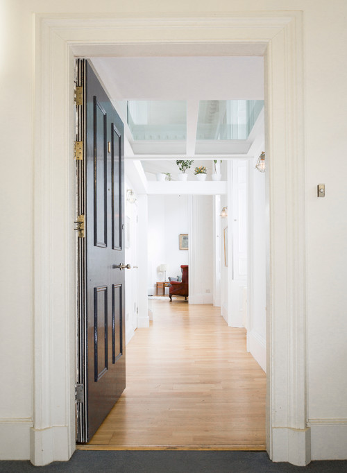
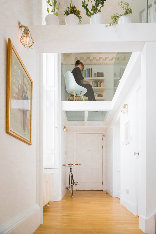
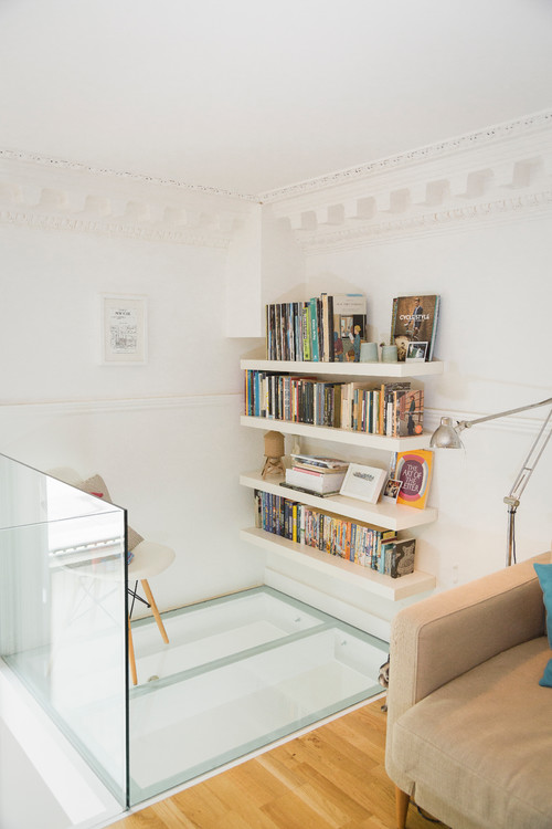
A thick, glazed floor was used in this corner of the mezzanine to create an interesting feature and also to allow more light into the hallway below. This little nook has become a library area.
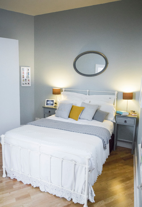
The couple wanted a clear difference between the public space downstairs and their private area, so they’ve used colour to define the two spaces. ‘We went for a light blue wall paint in here,’ says Thomas. ‘We wanted to play on the difference between the two areas: the bright, tall and airy living space and the bedroom, which is quite small. So in here, we’ve focused on the cosy elements and added painted bedside tables and a mirror that we found in a thrift store.’
Bed, Wrought Iron & Brass Bed Company. Walls painted inLight Blue, Farrow & Ball.
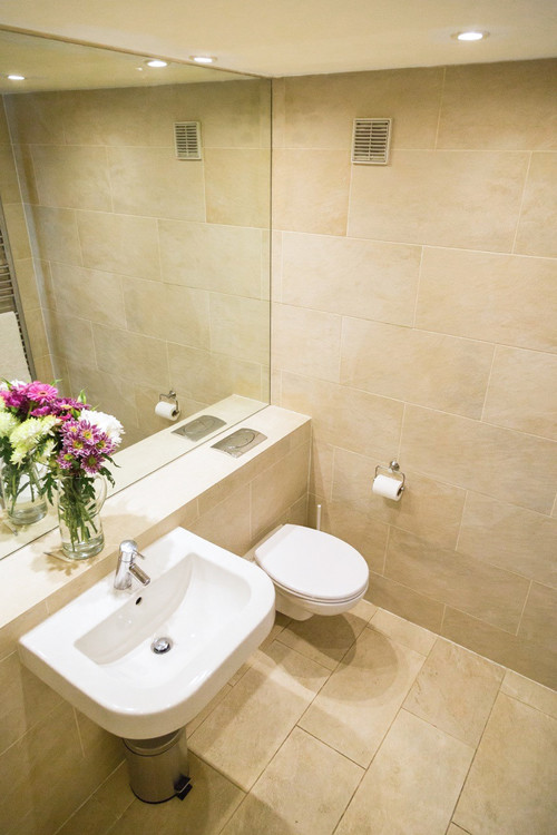
In the small bathroom, the couple cleaned up the existing tiles and sanitaryware and replaced the shower curtain with a new glass shower screen.
Edinburgh Architecture
3-8 St Andrew Square
Design: CDA and Gareth Hoskins Architects
photo © Adrian Welch
St Andrew Square Building
New Linear Accelerator Treatment Facility in Edinburgh
New Linear Accelerator Treatment Facility
RBGE Edinburgh Biomes
RBGE Edinburgh Biomes Construction
Comments / photos for the Mezzanine Apartment in Edinburgh page welcome.
