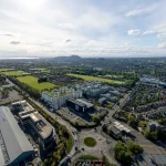
Museum of Scotland photos, Modern Scottish architecture images, Chambers Street location
Museum of Scotland Edinburgh Building
Modern Museum building: Edinburgh design by Benson & Forsyth Architects.
post updated 27 July 2021
Location: Chambers Street, Old Town
Extension to Royal Museum of Scotland, Chambers St, Old Town, Edinburgh, Scotland
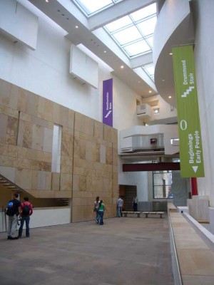
Museum of Scotland building photo © Adrian Welch
Museum of Scotland Edinburgh Building Design
Refurbishment, 2004
Controversy emerged (19.02.04) after a Blue banner proposal onto George IV bridge:
“Changes made to the award- winning Museum of Scotland building have been slammed by one of its original architects.
Museum of Scotland building photo © Adrian Welch
The alterations have been branded “tacky, crude, cheap and inappropriate” by Peter Wilson, the former project architect for the museum. He has hit out at the use of DIY building materials such as MDF in changes to the interior of £ 50m Museum of Scotland.
Museum of Scotland building photo © Adrian Welch
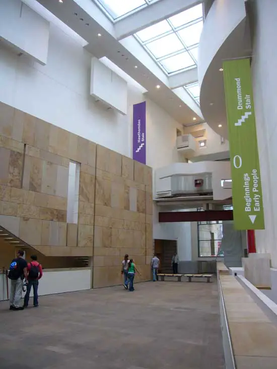
Among other changes criticised by Mr Wilson was the removal of a large stone desk from the museum’s vast reception area, Hawthornden Court, which he said left it feeling like a railway station.
Alterations to spiral staircases, where MDF has been used to fill in gaps between the stairs, were tacky, he said, and the removal of a key tapestry, to accommodate a 40-foot-long mural by Ian Hamilton Findlay, left an adjoining Museum of Scotland gallery area “purposeless”.
He has been backed by another leading architect who branded some of the changes “wretched.” The changes to the museum have all been made since Gordon Rintoul took over as director from Mark Jones in 2002.
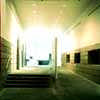
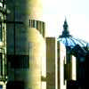
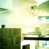
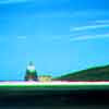
Building images supplied by Benson & Forsyth Architects
Mr Wilson said the changes did not reflect the original design of the building. “When this building was designed, we thought about it in great detail, everything was very carefully considered, with a purpose and a meaning,” he said.
“If you change the design it transforms the meaning of the building, and not really for the good.
“If the building was an object in the collection it would be treated with kid gloves, but because it is the actual building it does not seem to matter.” One of the Museum of Scotland changes which most annoyed Mr Wilson were the alterations to the spiral staircases in the museum. They were originally designed to filter light down the staircases, but the spaces between every step have now been covered with MDF.
“This is a tacky intervention,” said Mr Wilson. “I think it is crude and it is cheap. The whole point of the staircase was to draw the light down, but now it is blocked out completely.”
The changes to the Museum of Scotland were reportedly made because visually impaired visitors had found it difficult to negotiate the stairs.
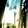
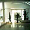
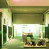
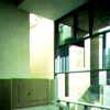
Chambers Street building images supplied by Benson & Forsyth Architects
Charles Prosser, secretary of the Royal Fine Art Commission for Scotland, has previously slated the museum for initiating the changes, saying they were “banal” and more expected in a supermarket or airport. The RFACS wrote to Dr Rintoul last year to express their concern over the then proposed work.
The programme of improvements, started in August last year, was based upon both comments received from visitors and the experience of National Museums of Scotland in operating the building. A spokeswoman from NMS said the changes had succeeded in making the museum a friendlier place for visitors.
“These improvements have provided a friendlier, more welcoming and enjoyable experience for visitors,” she said. “NMS believes the changes are entirely appropriate.
“The gaps between the stair treads were filled in following a disability audit which revealed that some visually-impaired visitors were having difficulty distinguishing between the steps and the gaps between them.”
Museum of Scotland bosses were slammed last year for “insensitive” changes to the entrance hall at the museum, which was a runner-up in the Stirling Prize architectural contest in 1999″.
from Scotsman 19 Feb 2004
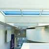
photograph 2007 © Jason Baxter
The original Museum building – formerly Royal Museum of Scotland, with its beautiful, airy atrium:
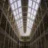
Chambers St building photo © Adrian Welch
Museum of Scotland: Description
Museum of Scotland Building Extension, Chambers Street
Date built: 1999
Benson + Forsyth Architects
Fantastically rich assemblage of spaces/forms with references to Modernism and the immediate context of the Old Town. This is Benson + Forsyth’s first major building and was followed up by their similar Museum building in Dublin.
Benson & Forsyth Architects won the New Museum of Scotland competition – judged by likes of Hans Hollein and Eva Jiricna – to design an extension in 1991.
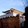
Chambers Street building photo © Adrian Welch
The Museum of Scotland has excited much controversy, from displeasing Prince Charles at competition stage, to its exclusion from the 1999 RIBA Special Category Award Shortlist and later parachuting in to the 1999 RIBA Stirling Prize Shortlist, for which it received the Runner-up Award.
Numerous letters appeared in the architectural press about this situation with Alan Dunlop of Glaswegian practice Gordon Murray + Alan Dunlop irritating some with his claim that the building was not world-class, and project architect Peter Wilson lambasting both Mr Dunlop and Sebastian Tombs – secretary of the RIAS and in charge of the three-person judging panel – for not giving the new Museum of Scotland more credit.
Architecturally much has been made of the Museum of Scotland’s relationship toEdinburgh Castle, especially the Half Moon Battery, but most visitors will rarely see the two together, though a great view of the Castle can be had on the roof, and vice versa.
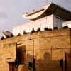
Entry to the Museum of Scotland is signified by the sentinel-like rotunda on the corner of Chambers Street. The building begins with a distinct architectural promenade that starts with the potent imagery of a huge table made from a single slice of tree trunk at the base of the corner tower. From here one turns first left through a narrow gap (with the access to The Tower – Museum of Scotland restaurant lift on the right) and then left again into a long hall, at the end of which is the ticket desk. The ‘entry hall’ to the Museum of Scotland is dissected by a long wall forming an unnecessary but intriguing edge to the ramp, at the top of which is some impressive stone carving.
However, once you enter the Museum of Scotland’s main space clutching your ticket you feel a bewildering loss of direction; some people just wander off whilst others ask an attendant or headphone provider. This space is the largest and most photographed in the building and is inspiring. Its aperspective form reminds one of the foyer at Jyväskylä University Library, but the other way round, and with the stairs descending. This space is successful but one feels it is let down a little by the rather ordinary roof with too heavy a structure. From here it is hard to describe the building methodically, so I will start at the top and work down.
As the curvaceous glass lifts take you up as far as the Fourth Floor (Level 5) you experience the contrast with the existing Museum of Scotland by Fowke; this is exciting but one feels the potency of this contrast has been lessened by the complexity. From here a quirky promenade takes you south into what I feel is the Museum of Scotland’s second space (not experienced here due to a clutter of exhibits) then doubles back in an ungainly way and out into the open.
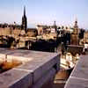
View from this modern Chambers Street building photo © Adrian Welch
The sudden contrast from warmth to often windy Scottish weather seems lost in the tight uncelebrated space. You climb a spiral stair – problematic when busy – to an inspiring roof terrace. The curved carapace/underbody of this space evokes Le Corbusier (Ronchamp, Chandigarh, etc.) and also Chamberlin, Powell & Bon and is very successful in creating a new landmark for Edinburgh.
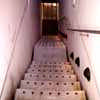
Stairs down from roof garden – photo © Adrian Welch
There is access to the roof (Level 7) by the internal lift further into the building, if you can find it. The views are spectacular, though the ‘moorland’ garden edge prevents vertiginous downward views.
Return to the Fourth Floor is down a narrow stair (or the lift) placed centrally in the Terrace – unusual and mystifying – which emerges bluntly into the exhibits. Later one sees the form of this stair from the ‘Southern Atrium’: I feel the potential of this relationship was not exploited (imagine the terrifying feeling of glass treads over a chasm below).
The southern Atrium is fascinating partly due to its huge and exciting exhibits, and less of an architectural setpiece, despite its domintaion by a white Corbusian half-drum form.
The Early People Exhibition in the Basement of the Museum of Scotland is by architects Lee Boyd and dates from 1998. The exhibits are from 8000BC to 1100AD and include 80 ancient stones, many works by Paolozzi and Goldsworthy. Unfortunately children and the disabled must search for an attendant to operate the access hoist. However the exhibition integrates well into the overall language of the Museum.
Excellent views can be had from The Tower restaurant at the top of the building with an excellent but pricey range of food.
In summary this building has stirred up the Scottish architectural scene and created much-needed creativity within Edinburgh’s often overbearingly conservative society. The building acts as a beacon – even to the many who disparage it for being over-worked – for contemporary architecture, for bravely seeking to add to Edinburgh’s legacy rather than slowly kill it by preservation.
Museum of Scotland build cost: £40-60m, approximately
Judges : Hans Hollein ; Eva Jiricna
Runner-up for the Stirling Prize 1999
won by Future Systems Architects for the Lord’s Media Centre
Blue Advertising Banner
News excerpts re the Museum of Scotland, Edinburgh:
Big Blue
A row has broken out over plans to erect a giant banner on the side of Benson & Forsyth Architects’ Museum of Scotland, one of Edinburgh’s best-known buildings. The National Museums of Scotland want to install the six-metre-long blue advertising banner on the Museum of Scotland rotunda.
Aug 03
RFACS in new Museum of Scotland row
The Royal Fine Art Commission Scotland (RFACS) claims the re-design of the entrance hall in the award-winning Museum of Scotland building in Chambers Street resembles a “supermarket or airport”. The RFACs, which has demanded a meeting with museum bosses, has labelled the re-model of the Museum of Scotland entrance hall “insensitive”.
Aug 03
Museum of Scotland: Presbyterian Court?
Museum of Scotland in Edinburgh
However, the focal point of the Museum of Scotland interior, Hawthornden Court – labelled “Presbyterian” even in the museum’s official history – has a cloistered atmosphere and is rarely full of visitors. Audience research has also shown that the entrance tower to Benson & Forsyth Architects’ design and the ramp up into Hawthornden Court have limited appeal for the museum’s public. To remedy these problems, National Museums of Scotland plans to relocate an information desk from the court to the entrance tower, where a second set of doors will also be established. A screen on the adjacent ramp will be removed to make way for Hamilton Finlay’s artwork.
People find the Museum of Scotland entrance area in particular a bit confusing, and that was one of the key things we wanted to address.
Some workers involved in the creation of Museum of Scotland believe the character of the displays was influenced too much by the building design team. In contrast to the older Royal Museum, next door on Chambers Street, Hawthornden Court lacks the bustle created by the mixture of seating, fish ponds and a café…the “transitional space” created by the entrance tower and the ramp – specified within the original building design brief – would be changed, and the visitor information service desk moved closer to the front door.“
View from Museum of Scotland Rooftop Terrace to Edinburgh Castle:
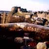
Chambers Street building photo © Adrian Welch
Next Door:
Museum of Scotland Masterplan
Contemporary Scottish Capital Property Designs – recent architectural selection below:
Royal Museum Masterplan, Edinburgh
Royal Museum of Scotland: image from gareth hoskins architects
The original Museum of Scotland from 1861:
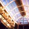
Museum of Scotland photo © Adrian Welch
Interior design work was done by local architectural practice lee boyd Architects.
Also by Benson + Forsyth, Architects: Scottish Parliament Competition Entry
Museum of Scotland redevelopment architecture practice – Gareth Hoskins Architects
Chambers Street building photograph © Adrian Welch
The building design reached the 1999 RIBA Stirling Prize Shortlist.
This Chambers Street building featured in AJ 7 May 98 + AJ 25 Feb 99 with Benson & Forsyth Architects profile.
Museum of Scotland photos : all photographs on file
Comments / photos for the Museum of Scotland Architecture design by Benson & Forsyth Architects in Edinburgh page welcome
