Edinburgh Edwardian Home Refurbishment, Scottish Capital House Interior in Portobello guide
Edinburgh Edwardian Flat Refurbishment Guide
Seafront Property Renewal in the Scottish Capital by Camilla Pringle Interiors
3 Jul 2017
A Sleek Kitchen with Coastal Views Outside Edinburgh
Pale colours and luxurious details give this kitchen an elegant yet understated feel that doesn’t detract from the spectacular views – Article first published on Houzz
Edinburgh Seaside Flat Refurbishment
Cathy Rebecca, Houzz Contributor
As one of four flats in an Edwardian mansion overlooking a beach on the Edinburgh coast, the starting point for the design of this room was the rugged landscape. ‘The clients wanted the space to tie in with the tones of the sand and sea outside,’ explains Camilla Pringle, who was responsible for designing and supplying the kitchen.
The owners decided to renovate the entire flat before moving in. Chalmers & Co were the architects and project managers, and Camilla was brought in towards the end of the project to work on the kitchen and advise on the colour schemes. ‘The space was basically fresh to fix when I arrived – the electrics were just being finished and we were walking on floor joists,’ Camilla explains. ‘The family were very design conscious and had a very good eye, so they were dream clients,’ she says. ‘They knew what they wanted, so the brief was very concise and easy to follow,’ she adds.
Kitchen at a Glance
Who lives here A family
Location Outside Edinburgh, Scotland
Designer Camilla Pringle of Camilla Pringle Interiors
Size 6m x 12m (including a seating area)
Photography by Douglas Gibb Photography
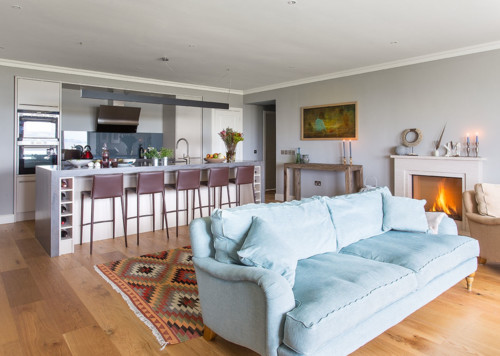
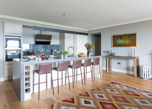
The space is very large, with the whole room measuring approximately 6m x 12m, and was designed primarily for entertaining. ‘The family wanted a space that could accommodate lots of people, but also function as a family room,’ Camilla explains. The owners have an extending table that can be brought out for dinner parties, then pushed to the side when not in use.
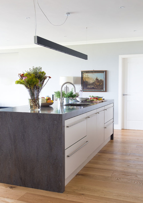
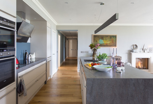
Having clients who had done their research well meant Camilla was able to focus her attention on the finer details. The family knew they wanted a large kitchen island, which ended up being 3.2m in length, to make cooking a more sociable experience.
The Corian worktop was part of the brief and Camilla was able to advise the clients on the thickness, which ended up being 80mm. ‘It was the most aesthetically pleasing and gave the most wow factor,’ she says. ‘It’s big and chunky, so it can give that substantial and grounded note to the room.’ The finish is Lava Rock, and it has a very similar look to polished concrete. It’s quite an industrial look, but feels soft in this setting.
Read expert advice on choosing your perfect worktop
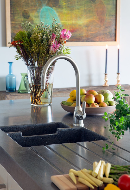
A close-up of the sink reveals some of those smaller details that make a kitchen like this such a pleasure to use. The Corian worktop was brought in as one piece, with the sink – which has Corian sides and a stainless steel base – moulded into it. ‘It was great to watch the Corian being installed,’ Camilla admits.
Mixa sink, Corian. Tap, Perrin & Rowe.
Symmetry was an important factor in the design of the kitchen. ‘I’m a bit obsessive when it comes to symmetry,’ Camilla admits. ‘I wanted the kitchen to be kept quite minimalist in order not to distract from the views, and having everything symmetrical kept the look neat and tidy,’ she explains.
Two doors to the left and right of the kitchen area set the tone for the rest of the space. The door to the left leads on to a utility space, and on the right is a walk-in larder. These additional storage areas gave the designer more freedom to keep the kitchen area sleek and sophisticated.
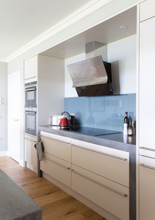
Camilla worked the symmetry further with two full-length cupboards either side of the work space, one housing a fridge-freezer and the other an oven and grill.
The small metal disc near the centre of the island is in fact an electrical socket, containing USB ports and plug sockets, that pops up when needed, making the space even more multifunctional.
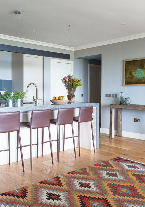
Camilla also gave a colour consultation for the rest of the apartment, and the smooth blue tones of the hallway are visible from the cooking area. In the kitchen, she used Farrow & Ball’s Hardwick White on the walls and Pointing on the woodwork and ceiling.
Ovens, Siemens. Hob, Britannia. Cooker hood, Best.
The engineered oak floor tones nicely with the wood and leather furniture. As the clients were very design conscious, they were able to source many of the pieces themselves, including the brown leather bar stools, console table, artwork and rug.
Looking for bar stools for your kitchen? Browse the range on Houzz
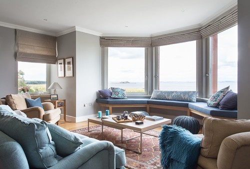
The view is the reason the clients bought the house, and it served as the starting point for the colour scheme and much of the design. The blinds are made from linen to keep a degree of transparency, so the view would never be completely out of sight.
Sofa, John Lewis. Coffee table, BoConcept.
Discover great ideas for framing a picture perfect view
Comments for this Edinburgh Edwardian Flat Refurbishment post are very welcome
Edinburgh Architecture
Edinburgh Georgian Townhouse Apartment
Glamorous Edinburgh West End Apartment
Mezzanine Apartment in Edinburgh
Design: CDA and Gareth Hoskins Architects
photo © Adrian Welch
St Andrew Square Building
Comments / photos for the
Edinburgh Edwardian Seaside Flat Refurbishment page welcome
