Georgian Townhouse Apartment Edinburgh, Scottish Capital Home, Jessica Buckley Interiors Scotland
Edinburgh Georgian Townhouse Apartment Design
Home in the Scottish Capital: Refurbished Property by Jessica Buckley Interiors
17 Jan 2017
Tour a Vibrantly Styled Georgian Flat in New Town
Jessica Buckley deliberately chose a smaller apartment than she could afford in order to fulfil her design wish list
Article first published on Houzz
Luxury Edinburgh Georgian Townhouse Apartment
‘The flat was perfectly average when I bought it,’ says interior designer Jessica Buckley of her now decidedly unaverage two-bedroom Georgian tenement flat in Edinburgh’s New Town. ‘It was in a decent state, but looked very “early ’90s” – in other words, plain and nondescript. But that’s why I bought it – I’m a designer: I wanted something I could pull apart and redesign completely.’
And that she has. The purpose-built flat has had a new kitchen (and a new kitchen location), a new bathroom, a relocated cloakroom and a smaller shower room – to make space for a new laundry cupboard – and a glamorous, colourful and interesting interior full of Jessica’s favourite fabrics, second-hand gems and finds from a well-travelled life.
Photos: Douglas Gibb Photography
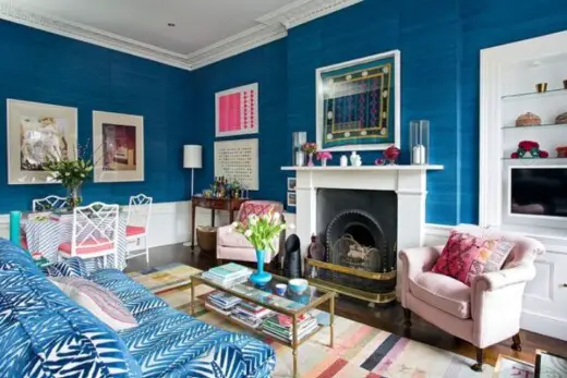
photo by Jessica Buckley Interiors – Look for living room design inspiration
Who lives here Interior designer Jessica Buckley and her partner, James, a plumber, plus their two cocker spaniels, Ruby and Skye
Location Edinburgh
Year renovated 2012
Designer Jessica Buckley of Jessica Buckley Interiors
Size 2 bedrooms, 2 bathrooms
‘With the budget I had, I could have bought something a bit bigger,’ explains Jessica, ‘but I wanted to decorate it really well, and to make it really luxurious and comfortable. I think a lot of people buy the biggest place they can, but I wanted to make sure there was enough money in the pot to do the flat as I wanted to.
‘It was also to be a showpiece for my business – I was a fledgling interior designer and wanted something that would show people what I could do. So I had to practise what I was preaching and go for it with bold colour and pattern.’
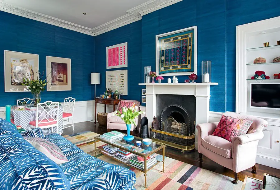
Interior design often starts with a piece that sets the theme or colour scheme for an entire home. In Jessica’s case, there were two starting points. Firstly, a crush on Neisha Crosland’s Zebra fabric, which now covers her sofa. ‘I’d seen it upholstered on a showroom chair when I was still studying,’ she says, and thought, “One day, I’m going to use this amazing fabric on something!”’
Secondly, she’d been eyeing a deep blue grasscloth wallpaper by Phillip Jeffries for a while and decided she had to have it for the living room. So with sofa and wallcovering sorted, the rest of the flat evolved around them.
This turquoise side table complements the darker blues gorgeously. ‘I had a couple of the vases around the flat already, but hadn’t thought to put them together until I found the table online for £20,’ she says. ‘I just love that colour!’ The others she picked up over time in junk shops.
Pink is another key colour in the living room, and Jessica had the dining chairs reupholstered in dusty rose fabric. ‘Chinese Chippendale or chinoiserie chairs were popular in the 17th century,’ she says. ‘They came back into fashion in Palm Beach and Florida in the 1950s and have had a bit of a resurgence again. I found a set of six online and had them painted white – the other two are in the kitchen.’
A brighter pink sings out from the end wall in the form of a print by the wallpaper designer Kirath Ghundoo. The artwork below it is a Damien Hirst Spots print. Jessica disguised a ‘not particularly stylish’ table with a fabric skirt.
The artwork above the fireplace is a box-framed Aztec Suzani, a textile made in Uzbekistan. ‘I used to live in Central Asia,’ Jessica explains, ‘and this was a gift when I was there.’
Although there’s a lot going on in this room visually, Jessica has nailed the delicate art of pattern-clashing by sticking to a palette of colours dotted all over the room in different configurations.
The only structural work that was needed in here involved the window seating. ‘When I first moved in, the window seat was already there, but just too high,’ Jessica says. ‘All the windows have original shutters, which meant there was no space for a window seat cushion. So – it might sound ridiculous – I had them taken out and rebuilt lower so there was space for a cushion as well as for the shutters to open and close.’ She incorporated storage underneath them, too. ‘They stash all sorts of household bits and pieces.’
Ticking fabric, Ian Mankin. Samos fabric on armchair and footstool, Vaughan Designs. Zebra fabric on sofa, Neisha Crosland. Spectrum rug, The Rug Company.
Inspired by this living room? Find more like this on Houzz
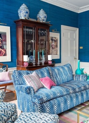
photo by Jessica Buckley Interiors – Discover eclectic living room design ideas
The striking photographic portraits are Jessica’s own, taken while she was travelling in north India and Papua New Guinea. As well as travel mementos, family heirlooms feature heavily in the flat – the antique glass drinks cabinet was inherited from Jessica’s grandmother. The coffee table was a vintage find online.
Discover tips for creating an eclectic look
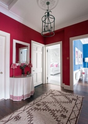
photo by Jessica Buckley Interiors – Discover hallway and landing design inspiration
The one-floor flat is arranged around a central hallway, from which you get quite a colourful view. ‘Yes, I didn’t worry too much about a “colour flow” throughout the flat,’ Jessica says. ‘I think people can get a bit hung up on things having to flow from room to room. It’s something to consider, but I don’t allow it to be a ruling factor – ultimately, if you want a red hallway you should have one.’
Moroccan rug, Larusi. Walls painted in Rectory Red, Farrow & Ball. Bronze lantern, Julian Chichester (no longer available).
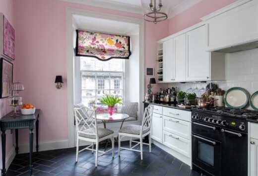
photo by Jessica Buckley Interiors – Browse kitchen ideas
‘When I told people I was going to have a pink kitchen, they looked at me as if I’d lost my mind,’ laughs Jessica. ‘But I think it’s just so pretty, and the black and white sharpens it all up – I didn’t want it to be blowsy.’
She and her decorator mixed the paint colour. ‘We slopped some paint between cans, a bit unorthodox, but the result is very close to Farrow & Ball’s Middleton Pink, which is in the bathroom,’ she says.
The floral blind is made from Misia fabric by Manuel Canovas. ‘Kit Kemp [the hotel designer] had used it in the Covent Garden Hotel and I thought it was really beautiful. It’s quite expensive, but this piece was a remnant I picked up on a trip to London. At the time, I had no idea what I’d do with it.’ She had the fabric trimmed with black and designed the bottom edge to feature the same curve as the backs of the chairs.
Seat pad fabric, Ian Mankin. Blind made from Misia fabric, Manuel Canovas. 90cm cooker, Rangemaster.
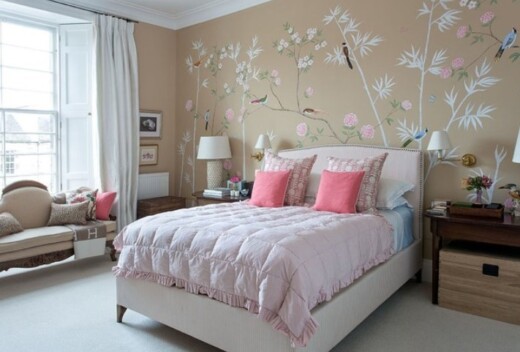
photo by Jessica Buckley Interiors – Discover bedroom design ideas
Jessica’s bedroom has a striking feature wall and is another example of the designer’s resourcefulness. ‘I was lusting after some hand-painted silk chinoiserie wallpaper by a company called de Gournay,’ she explains. ‘But it’s arms-and-legs expensive, so instead I found a mural artist and asked her to create a similar scene for me in paint.’
Jessica also got creative with the bed, which she bought from Sofas & Stuff, but customised with pink and white ticking. She had it raised, too: ‘I like that princess and the pea feeling of literally climbing up into bed,’ she says.
The bedside table is one of the ‘D-ends’ of an antique extendable dining table. ‘This style of antique – what people refer to, rather disparagingly, as “brown furniture” – has become quite unfashionable, but I love beautiful antique wooden pieces. I feel awful about having massacred the table, though; I chopped out the middle bit to create the bedside table.’
Explore more ideas for creating a feature wall that will stand out from the crowd
Jessica chose to keep window dressings neutral throughout the flat. ‘You need to let the eye rest with all the colour,’ she says. The curtains look wonderfully lavish. ‘Yes, they’re made from ivory silk with loads of interlining, so they’re really luxurious – sort of like window wedding dresses,’ she says. The chaise longue belonged to her parents.
Curtains made in silk, Henry Bertrand. Walls painted in Tawny Crest, Dulux. For a similar silk eiderdown, try Counting Lambs. Bed covered in ticking, Ian Mankin.
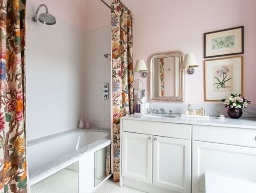
photo by Jessica Buckley Interiors – Search home design pictures
The double shower curtains are quite the feature in Jessica’s pink bathroom. ‘They are lined with a plastic curtain and the fabric itself is lined with pink ticking, so they’re quite luxurious, heavy curtains. They really prettify, dress up and soften the room and make it look much less bathroom-y.’
Jessica already had two mirror panels and decided to use them on the side of the bath. ‘It visually opens up the space, giving the impression the floor runs underneath the bath. Ideally, I’d have liked one big panel, but I made use of what I had.’
The Carrara marble basin top is a bespoke design.
Curtain fabric, GP & J Baker. Walls painted in Middleton Pink, Farrow & Ball.
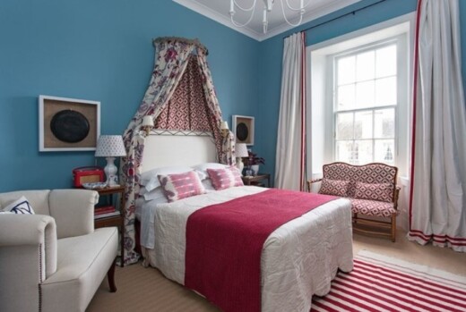
photo by Jessica Buckley Interiors – Discover bedroom design inspiration
The guest room was originally the kitchen, and vice versa, before Jessica renovated. She deliberately lived in the flat for a year before making any major decisions in order to get used to the space.
‘I was going to have the kitchen done first,’ she reveals, ‘but it slowly became apparent the rooms were the wrong way round – the guest room was flooded with light, and in Edinburgh you really want to make the most of the sun when you get it. It seemed a waste to have all that sunlight in a room used only occasionally.’
The ikat cushions on the bed are made from fabric Jessica picked up in Uzbekistan, and she now sells similar designs in her own shop. She bought the rug in Morocco. The box frames on either side of the bed hold tribal ceremonial food bowls she picked up in Papua New Guinea.
Jessica wanted a fairy-tale feel in this room. ‘I wanted my guests to feel as if they were in a luxurious space, so I went for quite an old fashioned sumptuous effect.’ She fixed a bed canopy to the wall above the headboard and draped lavish fabric from it.
Bed canopy, OKA. Walls painted in Polka Dot, Earthborn Paints. Find similar cushions at Jessica’s online shop. Fabrics: Beauregard by Manuel Canovas, and Samos by Vaughan Designs.
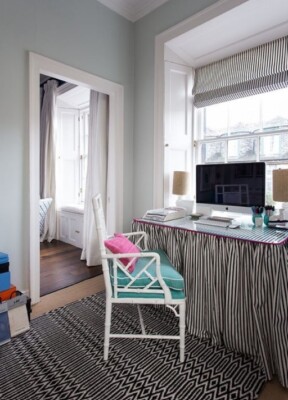
photo by Jessica Buckley Interiors – Look for contemporary home office and library pictures
Jessica’s study is next to the kitchen, and she chose to make this a smaller room, allowing her to give some extra space to the kitchen, where she can now fit in a larder and recessed fridge.
A clean, white Ikea drawer unit stashes Jessica’s fabric samples. Artwork she picked up in New York has been mounted in box frames.
Jessica’s study features another table skirt in Ian Mankin ticking, with bright pink piping around the top. The bespoke blind is made from the same fabric. She had a piece of glass cut to fit the table and provide a solid working surface.
Underneath the desk is Jessica’s printer, as well as beds for the two dogs. ‘It’s a cosy little den under there for them,’ she explains, ‘and they keep my feet warm in winter.’
Browse 10 home-working spaces designed to boost creativity
Rug, Plantation Rug Company. Walls painted in Pale Powder, Farrow & Ball. Alex drawer unit, IKEA.
Comments for this Georgian Townhouse Apartment Edinburgh design decor post are welcome.
Edinburgh Building Developments
Edinburgh Georgian Townhouse Restoration
Mezzanine Apartment in Edinburgh
Comments / photos for the Georgian Townhouse Apartment in Edinburgh interior design by Jessica Buckley Interiors page welcome
