Westport, Reiach and Hall Architects, AMA, Building, Architect Project Design
Westport Edinburgh : Architecture
Westport, West Port / Lady Lawson St, Edinburgh design by Reiach and Hall Architects.
15 May 2003
Design: Reiach and Hall Architects
Neil Gillespie, Jo Roxburgh in conversation with Adrian Welch
Westport Edinburgh
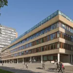
We started by crossing the road to view the building from the other side of West Port. The building clearly picks up on angles in plan of the two streets that it fronts, also the fall of the site. Neil described the building as using these two devices to create form.
The large drop of 5 to 6m meant difficult site conditions and an underpinned edge. With the clashing grids, it also brought energy to the building, and not just its facades, for the level changes and grid layering continue unabated inside.
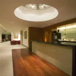
A key aspect of the Westport building is that it is speculative. This is a shock when confronted with the luxurious entrance foyer. Neil suggested the high specification was partly assisted by the Client – AMA – being marble importers. The travertine floor is visually soothing and delicately modern with its regular bar patterning.
The simple freestanding wall behind the long reception desk is redolent of Mies’ Tugendhat House and its gorgeous reddish onyx wall that glows with Czech sunsets. In fact this warm-coloured wall – patinated like burr walnut – is also of travertine, but cut into the bed. It is patterned with subtle (everything in this building is subtle, refined) rectilinear striations, gently offset to form harmonious asymmetry.
A ramp leads out of the foyer to a north-south axis connecting stairs, toilets and lifts. Unguarded, as it rises less than 600mm, the travertine ramp with travertine kerb is a piece of sculpture. It has a diaphanous, glassy, otherness quality to it, solid yet liquid. Between steps and ramp is a ‘space’, a plinth in which the speculative office tenant can place a sculpture. Neil says they worked hard with the building regs, and it shows.
We enter the axial space and investigate the individual ‘executive’ toilets, which are accessed unlobbied, and have the potential to be unisex. Walls are covered in grey mosaic; the dark etimo wood doors have no ironmongery other than simple thumb locks. The original idea was to have walnut, and then cedar, but this red, dark wood is hard and resilient.
Off the axis is a small, tall atrium: an Alan Johnson polished metal cylinder and flat plate suspended work is to hang within this space. Alan has frequent discussions with Neil re the sleeper gallery and Reiach and Hall projects.
Various threads run through the building. One such thread is the ‘slot’: slots in doors, slots of psace between elements, and window slots set just below eye level to limit views and energy being passed from one space to another. All details are considered and there is a language of simple flush joints rather than architraves and fiddly frames.
We enter the ground floor office to the north-west: it’s perimeter is pulled back slightly from Lady Lawson St to allow in light. This is Reiach and Hall’s fifth low energy building: the M&E strategy is to use displacement air, introduced at car park level, tempered, then distributed through plenum floors. It is finally extracted at ceiling level.
The soffit solution in this first office space we enter uses white-painted plastered concrete ribs between access panels, thus no ugly suspended ceiling. The Client was not keen to use fair-faced concrete that may put off certain tenants. The ribs neatly align with both the window mullions and the timber riser panels and run perpendicular to Lady Lawson St. They also allow future acoustic separation via partitions or screens.
In the other street level office, to the East of the entry, the offices rise above the street like at the architect’s Collective Gallery, with anodised aluminium trench heaters. To the back of this space the wall zig-zags to create a lightwell filled with white pebbles and formed by angles corresponding to the chevron parking system, form follows function but with a poetic sensibility.
The curvilinear liftcar, by Otis, wasn’t Neil’s initial choice and has a feel more in line with the Persian origins of AMA. The prevalent palette in the public spaces is white with cream, offset by the rich timber areas and steel details. The interior is luminous from reflected glow off glossy and light-toned surfaces. The circulation axis involves small bridges and the tall atrium, subtle invigorations in what could have been a dark corridor.
The escape stairs at either end of the circulation axis have breakout spaces with great views out. The stairs peel back from the walls, and are lined with simple glass balustrades; almost all elements in this building are separately articulated, making joints easier.
At the top of the building, a timber-decked area angles out towards the Castle with wonderful views, not least to the imposing old red sandstone of the Edinburgh School of Art. Beyond this are the clean lines of Ralph Cowan’s School of Architecture ‘bookend’ that Neil is rather fond of, partly through having taught there for many years. This space worked well at the grand opening, Jo says it is a great party building.
From the decking we could view three ‘lanterns’ concealing roof plant: if only all buildings were so thoughtful. So many views, such as from the Castle Esplanade or Oloroso’s Lounge are damaged by a multitude of ugly air handling units. The ‘lanterns’ are due to be lit up, thankfully not with currently ubiquitous and trendy ‘multiple colours’. In the adjacent office, the structural engineers were really pushed to cantilever the glazing out to allow a vignette of the Hub’s spire, at the top of the Royal Mile.
Moving back down the building I asked Neil about the angled breakout at mid-elevation onto Lady Lawson Street: why the ‘grand order’ of a massive window connecting two floors? Neil explained that the planners had wanted a tower here to talk to the turret diagonally across the junction. Instead a more ingenious solution was reached, a dominating fissure and protrudance in the flush elevation.
Neil steps back from the building to talk about the practice ethos continued since Alan Reiach and Robert Hurd’s ‘Buildings of Scotland’ in the 1940’s. He is disparaging of the Scottish Executive’s reference to ‘Scottish’ and ‘Architecture’ in its Architecture Policy. He invoked Loos and German terminology, the non-hierarchical Bauen, Baukunst, Architektur, explaining each one in turn. Architektur is not self-served, it comes over time, such as our west coast black houses.
We don’t know what the next generation will think of our architecture, ‘for all we know, perhaps some overlooked architect (hopefully) will be seen to be the key architects of our time’. The emphasis on building relates to simple, healthy structures, with decent ambition, ignoring stylistic concerns; we talk about Scandinavian projects such as Jacobsen’s schools, which I feel should be informing architects working on our current ‘production line’ of PFI schools.
In summary, the building uses the site to subtly inform the result. A fractured plan exists throughout, you see it in the elevations (reflecting the elevational context of feu plans), you see it in the internal lightwell’s irregular boundary and you see it in the rooftop lanterns that sit like thrown dice. The building has poise, it pauses, turns the corner in shifts; it drops down the slope with ease.
John Hope apparently wanted a soft landmark statement. Ken Powell and Isabel Allen complement the buildings ‘good ordinary’ approach and Neil iterates this by saying Westport is akin to a general building trend that includes Sergison Bates, Florian Beigel, Tony Fretton and Caruso St John, and to an extent, the Smithsons. Neil quotes Irene Scalbert’s ‘Edge of Ordinary’ as a key influence.
This building is – for a speculative office block – poetic, refined and oozing quality. AMA are to be congratulated for commissioning such a building and I would hope our planning system could encourage many more Scottish buildings to attain this level.
Westport is formally known as Evolution House
Westport Building Designs
Westport Property Designs – recent architectural selection below:
Context to this buildking:
Also by Reiach and Hall Architects: Wolfson Medical School, Glasgow
Kenmore proposal to replace West Port House
Just East of West Port is the Grassmarket:
Scottish Capital Building Designs
Contemporary Scottish Capital Property Designs – recent architectural selection below:
Comments / photos for the Westport Edinburgh page welcome


